Member-only story
How to create a waterfall chart in Tableau in less than 10 steps?
This tutorial will help you understand how to create a waterfall chart in Tableau. If you want the Tableau file and Excel data of this example, just message me on LinkedIn!
But firs, let’s start by quickly explaining what is a waterfall chart, what is Tableau and some of its use cases for finance professionals.

What is a waterfall chart and why Finance professionals like it?
A waterfall chart is a type of chart that is used to visualize how a certain value changes over time, where each change is represented as a step or a “waterfall” in the chart.
Waterfall charts are often used in finance to show the breakdown of changes in the value of an investment or a portfolio over time, such as the changes in the value of a stock or a bond, or the changes in the value of a sales forecast by category or business unit.
Finance professionals like waterfall charts because they provide a clear and intuitive way to visualize changes in the value of an investment or a financial forecast, which can be helpful for making data driven decisions.
What is Tableau?
Tableau is a powerful data storytelling and visualization tool that can be used in corporate finance for a variety of purposes. Some common use cases include:
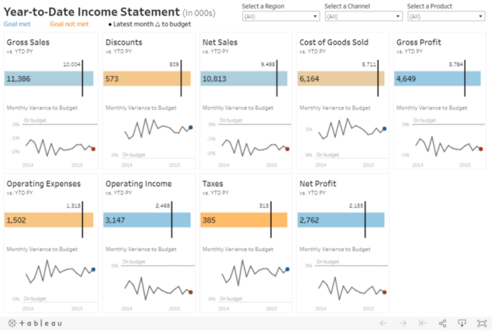
- Analyzing financial data, such as income statements and balance sheets, to identify trends and make informed business decisions
- Creating dashboards and reports to present financial data in an easy-to-understand format for internal stakeholders and external investors
- Building financial models to forecast future performance and assess the financial impact of different business scenarios
- Identifying key performance indicators (KPIs) and tracking them over time to measure the health of the business.
You can learn more about Tableau and get some inspiration for finance use cases here.